Case study · Presentation design
Dan Potter
webinar deck.
A 27-slide academic presentation designed to make a complex clinical idea easier to follow.
Case study · Presentation design
A 27-slide academic presentation designed to make a complex clinical idea easier to follow.

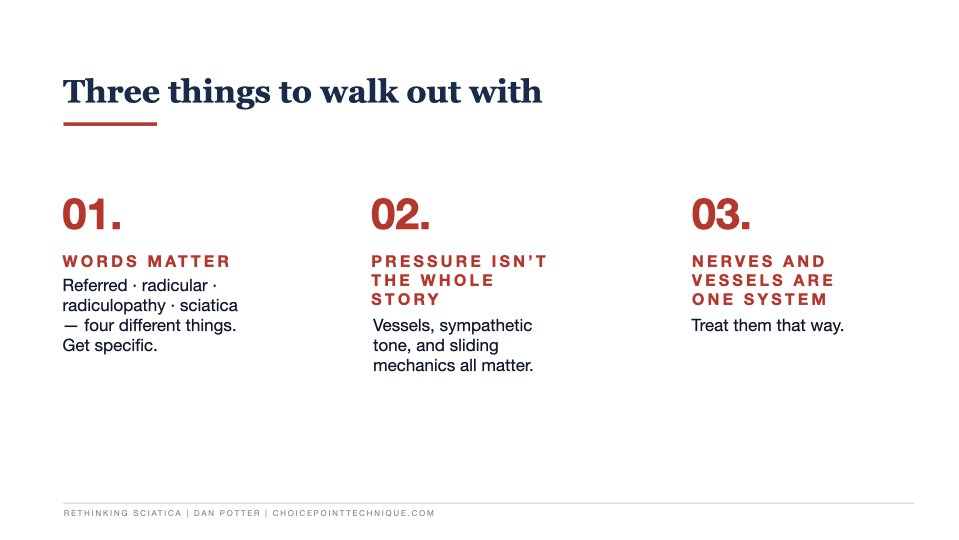

The challenge
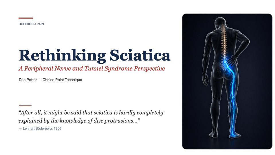
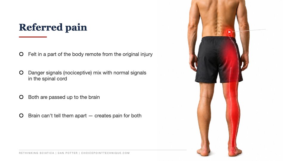
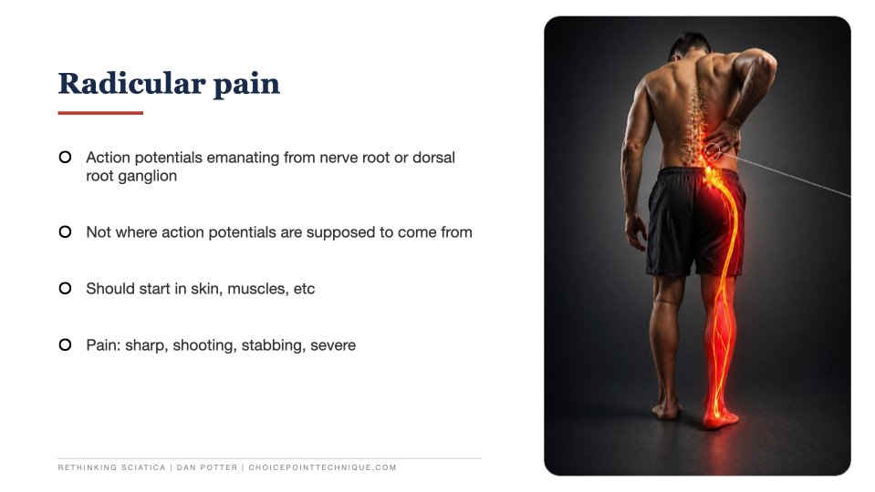
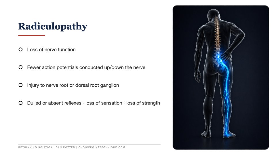
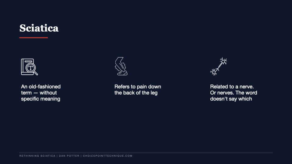
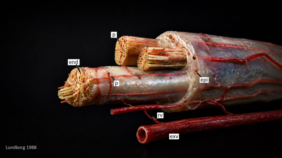
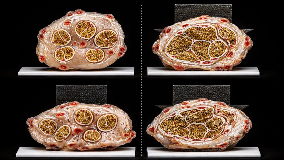
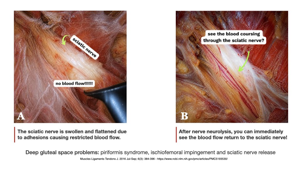
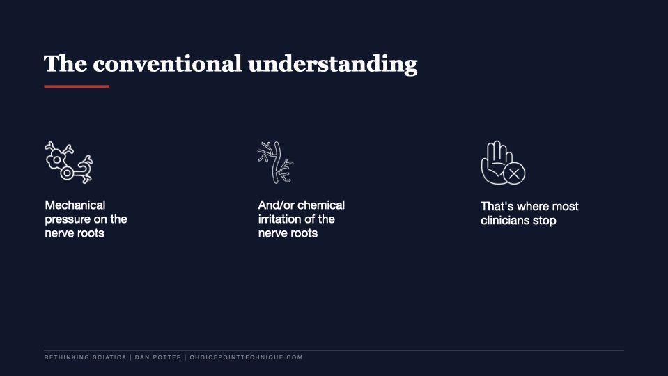
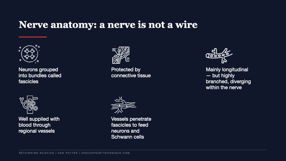
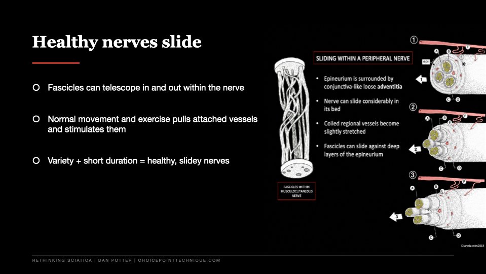
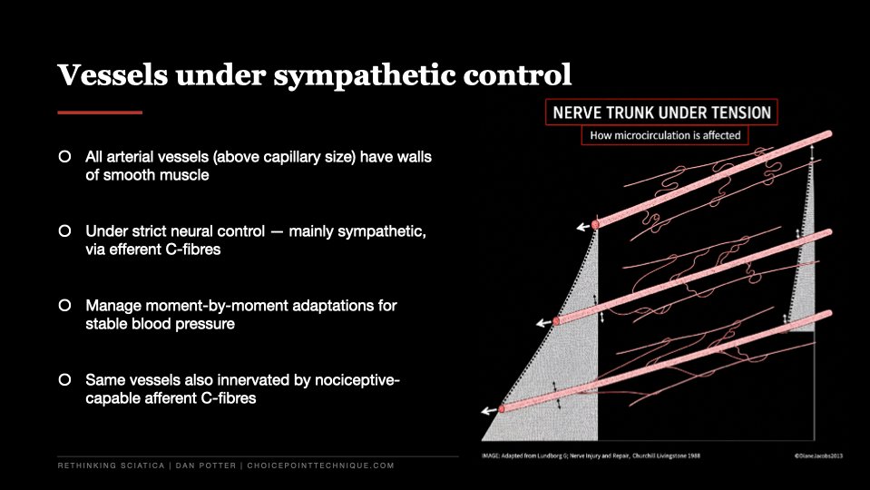
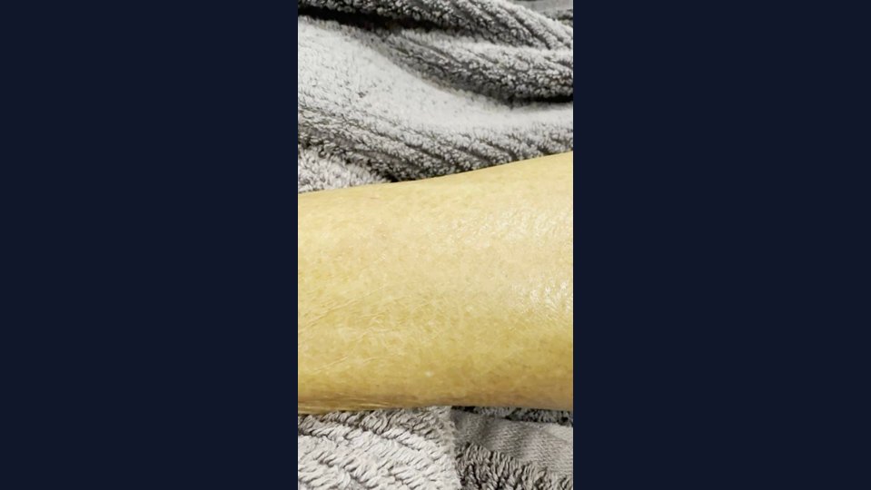
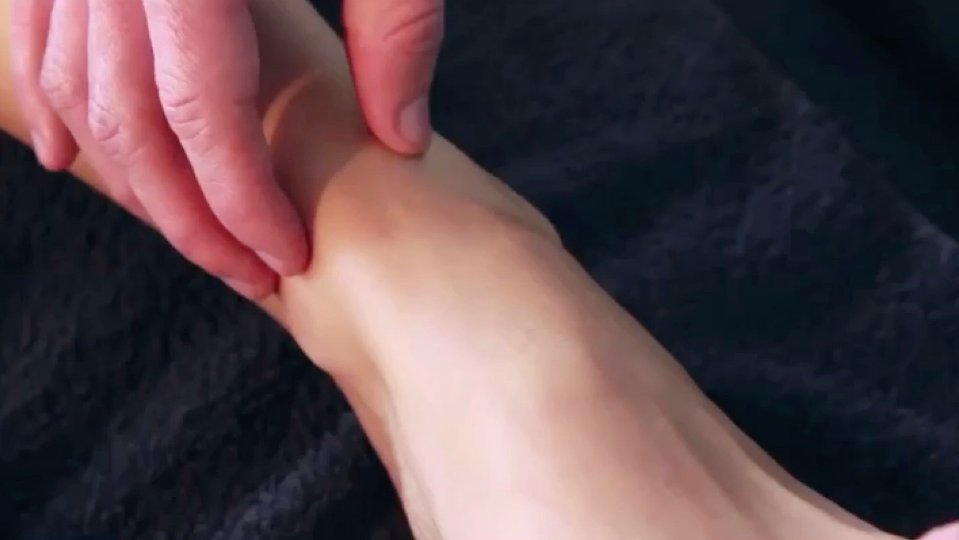
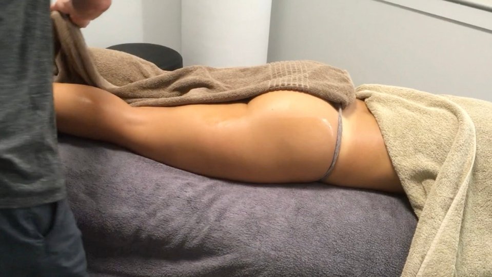
The topic — referred pain, rethought from a peripheral nerve and tunnel syndrome perspective — sits squarely in clinical territory. The supporting material was image-heavy, technical, and arrived in tranches across the project. The client-supplied image library needed sorting, cleanup, and structure before it could carry the talk.
The brief wasn't "make slides look better." It was: take this body of clinical thinking and turn it into a presentation Dan can actually teach from in a lecture theatre.
The approach
Sort the source
Reviewed and organised the supplied image library — clinical references, anatomy plates, diagrams, and supporting media — into a working set we could actually build a presentation from.
Shape the flow
Mapped the deck around the live teaching context. Built a sequence that opened with the clinical idea, walked through the evidence, and gave Dan natural beats to teach from.
Build the visual system
Designed a clean, restrained visual language appropriate for a medical/academic setting. Hierarchy, type sizing, image crops, and slide-to-slide consistency all working off the same grid.
Balance the load
Held the balance between text, anatomy imagery, citations, embedded media, and presenter pacing so no slide felt overloaded or empty.
Final polish
Senior-designer review pass for hierarchy, spacing, image placement, and a clean export ready to present.
Deliverables
Outcome
The deck was used to deliver the talk at the University of the Sunshine Coast to 70+ attendees. The presentation went well, and the deck gave Dan a clear, professional visual structure to teach a complex topic from — usable again as a recording or resource afterwards.
Design and communication work, not a clinical claim — the medicine is Dan's. The deck simply made it easier to follow.
Have a deck that needs turning into something clear and polished? Send me what you have — slides, notes, raw images, a brief — and I'll tell you what bracket it fits into.